Kinetic Typography: 5 Tips for Marketers to use it in Video Campaigns
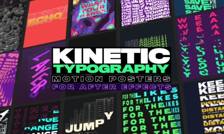
Kinetic typography is a type of animation that uses moving text to grab the viewer’s attention, create the tone, and entertain them. Commercials, music videos, mobile applications, and websites all use it to make their text more effective and add a touch of creativity. Kinetic typography fascinates people since it enables words to be presented brilliantly and vividly. The opening credits of feature-length films are some of the most commonly known instances. Some performers use kinetic typography to draw emphasis to specific words, such as those found in hit songs’ choruses. However, because kinetic typography is so adaptable, it may also be used in video marketing campaigns. The team compiled a list of 5 tips to help marketers use this approach in significant ways to engage the audience and deliver messages effectively.
1. Optimize for readability
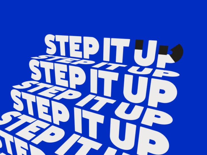
We frequently underestimate the importance of text — especially, the appropriate font and typeface. The typeface you choose for your video campaign may either make it or break it. It doesn’t matter how attractive or user-friendly the font you choose is if people can’t read the text. This feature, also known as readability, is vital to the success of any video campaign, especially because your content may be shown on a variety of devices, ranging from a small smartphone screen to a large display. The capacity of the text to transmit information is the most crucial factor to consider when selecting a typeface for video. The text should be straightforward, clear, and concise. Use a typeface that is both simple to read and unobtrusive. A professional, easy-to-read font may help communicate your message even if the viewer is in sound-free mode. The best fonts constantly used in a variety of video texts include Arial, Gill Sans, Gotham, Helvetica, Impact, Futura, or Trade Gothic. Avoid using fonts like Comic Sans, Impact, Papyrus, or Times New Roman.
2. Experiment with combining words and shapes
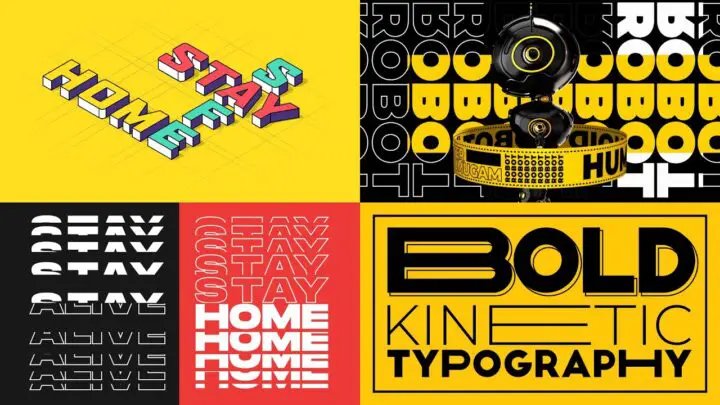
Kinetic typography allows marketers to express their creativity in ways that static forms of media do not offer. Make your video more dynamic by combining words and shapes. Spice it up with trendy fonts and various text appearance effects. They may use that fact to create eye-catching effects by combining words into a form that corresponds to the audio soundtrack content. When used correctly, the shapes in video marketing campaigns help to grab the viewer’s attention. Even if marketers have limited resources and cannot afford to create kinetic typography videos as long as TV ads, it is acceptable to send brief messages as well. It’s critical to render the exported video with the highest quality settings possible. Why spend time and money creating a visually appealing kinetic typography video when you can just publish it at a 320-pixel resolution?
3. Learn the art of pacing
Pacing is essential for any successful video campaign. Excellent kinetic typography examples stand out from the crowd because of their pace. The movement should match the rest of the text and offer unique aspects that make using kinetic typography for a campaign valuable. If your kinetic typography video is monotonous, it will not be successful. Surprise your viewers and make a lasting impression. The twist might occur in the middle or at the end of the video. Pay attention to the video’s timing by leaving some lines or sentences longer than others, or by speeding up or slowing down at various times. How you approach the pace is determined by the audio track you’ve chosen. Using a low-quality soundtrack is one of the most common mistakes that can lower the quality of your kinetic typography video. Before you utilize your audio, try to determine whether there are any difficulties with it, such as distortion. If you employ a voice actor to read the material, be sure they pronounce the words clearly with appropriate speed, accuracy, and expression. Keep in mind that, while kinetic typography is a visual medium, it also has an auditory component.
4. Check for grammar and spelling mistakes

Although this may seem simple, it is amazing how often businesses upload a video that has embarrassing grammatical and typographical errors. These mistakes may appear trivial to you, but they can be quite annoying to your viewers. It’s almost hard to go back and fix them, so double-check everything before you post it and never skip the proofreading process. If you want to be certain, have a professional writer draft the script for you.
5. Make your kinetic typography videos appealing
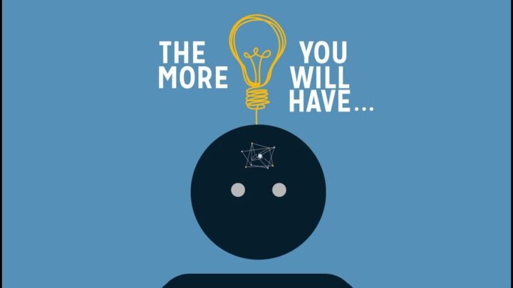
One of the main reasons why kinetic typography videos are so successful is that they add a much-needed element of fun. People are choosy about the videos they watch on the internet, and they will skip uninteresting films after the first few seconds, even if they contain valuable information. A kinetic typography video is known for being brief and to-the-point.
A kinetic video will help you to enhance your chances of generating leads and sales, since a video on your landing page may boost your conversion rate. You may display information in a more effective way when you utilize the kinetic typography approach. A kinetic typography video is known for being brief and to-the-point. Because kinetic text makes your content highly appealing, including them in your video marketing plan may dramatically increase your engagement rate. Your viewers will be willing to watch the entire video because of the appropriate pace, colors, music, and motion.
Kinetic typography is an extremely engaging way of representing text visually. It’s a great marketing tool for those who want to convey a strong message without boring the audience, and it’s also great for simply entertaining it. There are so many examples of kinetic typography videos on Youtube that it has already become a form of art. Click here if you are looking for a professional team to create outstanding kinetic typography videos for your company or brand.
