4 Different Photo Editing Styles to Try in 2024

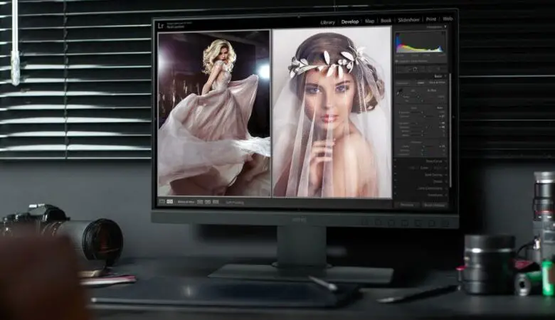
Doesn’t matter if you are working on Adobe Photoshop, Adobe Lightroom, Skylum Luminar, or on Corel PaintShop Pro, what matters is whether you have mastered your techniques and whether you have made your own and unique editing style.
Just because you are virtually drawing and editing, does not mean that this is not a form of art. No matter how much work you put it and what you create, it is still art like any other art form. So, just like any other artist, whether in music, drawing, singing, you need to find your editing style. Of course, this style you have developed can and probably will evolve in the future which is completely fine. Accepting changes and letting yourself advance in the art of editing is what makes a good editor.
However, as an editor, there always comes a time when you find yourself at a crossroads with no indications or information about where you should turn and where to go. You are looking back at where you have been, what you have created to help yourself advance forward, but you still cannot decide on what you should do.
I believe this happens to almost every editor, which is why I made this article to guide you into the style you want to build on. So, here are some different editing styles you should definitely try out in 2024.
Clean edit

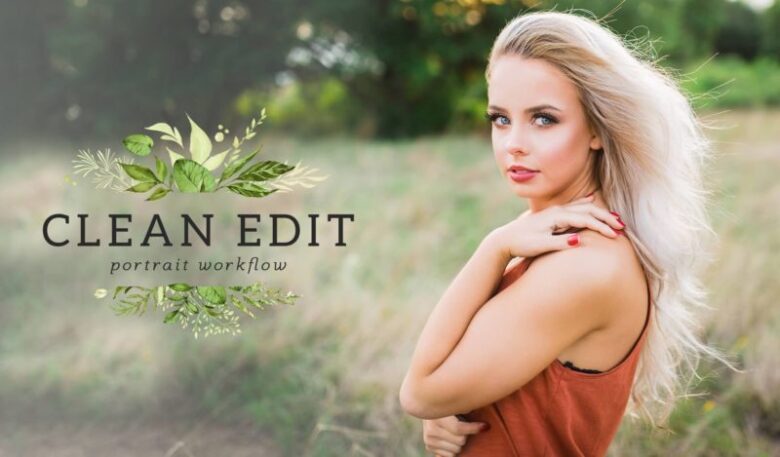
I believe that having a clean edit on a picture is one of the best styles you could build. Everything looks clean, sharp and realistic, giving you an honest representation of what you would see in real life. Of course, you will still need to work with color temperature to give the image a bit of contrast and play with the sharpness and clarity settings to make it look even cleaner.
Naturally, you don’t want to do overdo it with the sharpness because it can make the edges look burnt which is the complete opposite of natural and realistic.
This style is a classic and if you cannot decide what you want to do, you should definitely go down this path.
Many editors who are tasked with removing the background of an image love to do a clean edit first. Although, removing a background can sometimes prove quite difficult, especially if an image you have received is in a low resolution. Fortunately, there are companies out there that you can hire to do the background removal for you. Check out BackgroundRemover for their background removal services.

Matte edit
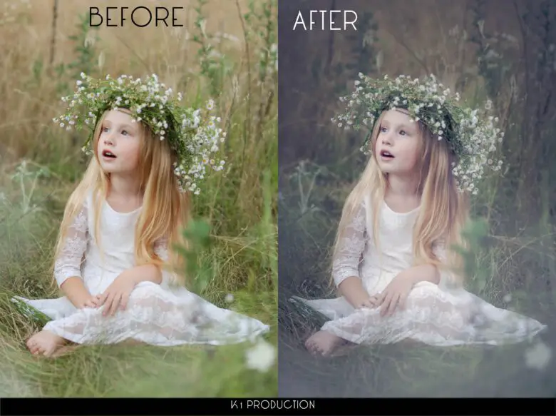
These last couple of years we have seen a huge trend on social media applications such as Instagram, Facebook, and VSCO adding a filter that makes images look matte. Of course, adding a filter on an app is nowhere near the quality of a Lightroom edit. This is why I recommend to every editor out there that they should try out what is currently trendy. Sure, this kind of effect on a picture might not be your favorite option because it kind of washes away the colors, but its popularity redeems it.
Many people like this effect because it gives the impression that the photograph was taken through a film which is something that is rarely done these days. Even owning a camera that uses film instead of a memory card is quite rare and can even be expensive. Fortunately, you can your customers happy without having to use a film camera since you can add in that look through the software you use. You still get the look, the quality without having to go through the process of processing and scanning the photography.

Personally, I think the matte effect looks best on black and white photographs and that you should avoid using it on ones that seem very saturated.
Strong Contrast
One way to create an image that will leave a strong impression and be eye-catching is to use a lot of contrast. The more contrast and vibrancy you add to the colors of the image, the better the shadows will look. This makes the image seem like it has a lot more depth to it. So, if you ever feel like a photo you have taken or you have received seems shallow, high contrast is definitely the way to go.
Keep in mind, when brightening the whites of a photo, some blacks may start whitening too which may ruin the shadows. If the blacks start turning blocky or pixel-y, you should definitely do a bit of darkening on the blacks.
Black and White

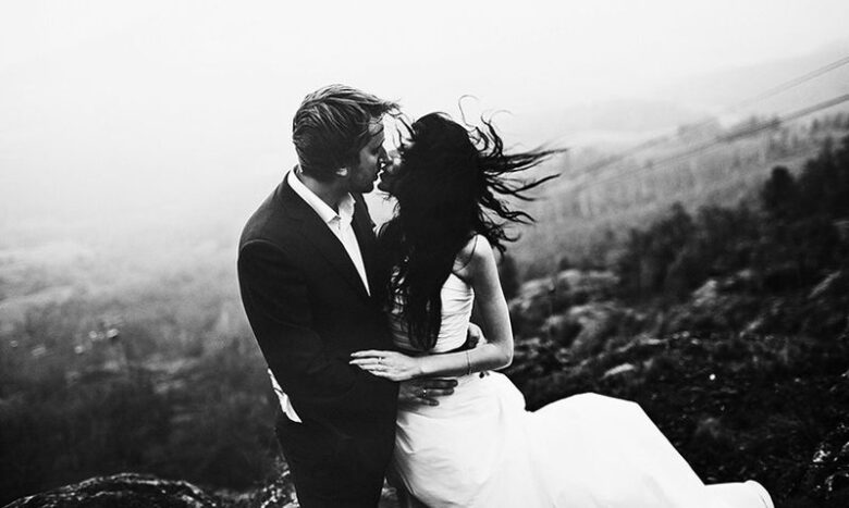
Another classic style of editing that has become very popular these last couple of years. This style is most commonly seen when the image depicts a close-up of a city’s streets, buildings, graffiti and everything else that shows the character of said city. Naturally, you could also use this style for a lot more different types of photos. You do not have to limit your ability to express yourself.
Many people believe that removing the colors of an image is just taking out the details, but that’s not true. It’s true that colors enrich an image, it is truly beautiful, but removing that aspect of an image, reveals other details that you wouldn’t otherwise notice. The black and shadows become a bit more transparent, showing a lot more detail in those areas.
Don’t forget that there are a lot of variations when it comes to black and white too. It’s not just one type of effect. You have a lot of freedom to play around in this range of colors. Bumping up the contrast will make a black and white look a lot sharper and clear. This is usually done when you want to show strong details in a photograph. Lowering the contrasts and giving a warmer look to the black and white is also useful, especially for family portraits or simple landscapes. Keep in mind, when lowering the contrast you are reducing the clarity of the details in the image.
